|
|
Post by notic on Oct 26, 2006 3:08:23 GMT -5
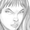
Hi guys, whoever was on myspace last night asked me what I had been working on recently, and instead of trying to reply on myspace (I'm not on it very often) I thought I would just start a new thread here. I'll post some of the things I've been working on recently in this thread so you guys can see what I've been up too (and maybe I can get alittle feedback in the process ^^) -This is the first thing I'll post up before I goto bed (more to come). I did a quick self portrait of myself for use in forums etc. I think this is actually the first self portrait I've ever done. You guys who have met me in person know I don't really look too much like this, but this is how I see myself in my mind's eye.  I'll post of some more stuff tomorrow, I'm off to bed. |
|
|
|
Post by neenjah on Oct 29, 2006 17:14:57 GMT -5
That reduced down nicely! Good work. Keep it coming.
|
|
|
|
Post by micah on Oct 29, 2006 22:46:24 GMT -5
That was me on MySpace.
Your self portrait looks great. I especially like the colors.
|
|
|
|
Post by notic on Nov 27, 2006 6:58:08 GMT -5
Hey guys, time for a work update finally. Sorry I haven't posted anything sooner, but I've been working pretty much completely on flat work recently and have finally gotten around to scanning stuff in and cleaning things up. I've retooled my workflow with the suggestions I received from Dave. I'm taking pretty much everything to the light table to make corrections on the reversed image. It still amazes me how much things pop out at me when I do this! I make corrections on the reverse then flip it back over, erase the corrected pieces of the original, then bring in a fresh sheet of paper and completely retrace the image. I get more satisfying results this way, but man does it take a lot longer! Much of it is probably getting used to doing things a different way, hopefully I can get faster. I don't have anything painted yet, only the scans. I'll share a few of those with you guys today. The first few are some character illustrations for a web comic me and a friend will someday get around to working on. It turns out he's as slow with turning out a script as I am with putting out new pictures, so I wouldn't hold your breath on us getting up and running any time too soon. In truth I simply have more important things to work on at the moment. These are also the first images I used to test drive the new method.  Nick - our main character. A Private *edit*Detective*edit*, lazy and sarcastic. Always looking to make a buck and find the angle.  Miranda - A secretary and special agent at the local police precinct. A helpful informant for Nick. Next up are some preliminary images from the project I'm working on for my new portfolio. I wanted to create a character with some interesting design elements, then incorporate those into the environments I'm going to produce for the project. I decided to use a North and Central American Indian motifs since those aren't used too often. Here are some examples of the jewelry I designed for the character.     I actually designed the overall character first, but I know I wanted her jewelry to be really intricate so I drew each piece separately and composited them back in for the final images. Here is the front and back views of the character.  Sorry if it's a little big on some of your screens. One of the main motifs that is used in this project is the Phoenix. I don't know if it's because I grew up here in Phoenix, but I've always been interested in Phoenix/fire/thunderbird mythology and the Phoenix as a Motif. On Shalla's headband, the image of the Phoenix is drawn. It's not really visible in the drawings, but on the 3D character, it will be easily visible on her bandanna.  Shalla is a strong woman, she fights with her Spatha and a M79 grenade launcher modified to fire magic (elemental) grenades. She however is not alone in her journeys. She rides, and keeps as a companion, a very large feline animal named Sarah. Similar to Battle Cat from Heman (Only without the talking or green color) This beast is extremely affectionate toward Shalla, but is dangerously violent towards unfamiliar strangers. It can run nearly as quickly as a cheetah and makes for an excellent mode of transportation. The world Shalla lives in is a bit different then ours and I'm taking some creative license with the animals. Here is a image I intend to color later of Shalla and Sarah togeather.  This project I'm working on has multiple parts, I'm currently finishing up on the flatwork and preplanning stages. Next I'll be creating this character (and a few others I'm not quite finished with) in 3D. After that, I'll begin creating the environment (or level) that this story takes place in. Ultimately it will be a playable demo piece that I can show to employers along with videos of the assets that went into creating this project as a tool to get a job. Feedback or questions are always welcome, sorry this post was a little frazzled, it's late and I'm doing this before I goto bed. I'll post updates to these images as I color them and also add more character illustrations as I finish cleaning them up. Thanks for taking a gander. *Edit - I guess you guys are using a filter for profanity. Nick was originally described as a private D..I..C..K (Minus the periods) but that got changed to private "Thingy" lol. I guess old Noir slang is too much hehe. |
|
|
|
Post by micah on Nov 29, 2006 22:58:25 GMT -5
It looks really cool. Did you digital ink them? The phoenix is really cool. I like all the intricate designs on your Shalla character but David did point out that it will drive you crazy to have to draw that over and over again. Not to mention it will be time consuming. But overall...Very Nice. I like.
Keep it up!
|
|
|
|
Post by notic on Nov 30, 2006 0:14:55 GMT -5
yes, the designs are driving me crazy with my flat work. Some of the spirits I'm working on, are worse then the girl in some ways. That is the one nice thing about doing 3D work, I only have to make it once lol. I'm thinking about using comic pages inside the demo to tell the narrative, which means I am probably going to want to kill myself later ^^ I've already come up with a "casual" outfit for her when she's not adventuring that is much less complicated.
Everything is digitally inked, it is all pencil work. I'm using a process very similar to yours although I find the 50% threshold filter dislikes some of my work >< So far the results have been pretty good.
I'll have another update tomorrow with some of the opponents Shalla will be facing.
|
|
|
|
Post by quickdrawmcgraw on Nov 30, 2006 4:02:09 GMT -5
Gorgeous character designs, I love the thick lines, and the eyes are well-done. I agree with Mikah on the phoenix, it really stood out to me too. Very nice works.
|
|
|
|
Post by notic on Dec 13, 2006 0:41:43 GMT -5
Misc. Updates. I've been doing a lot of 3D work lately so I don't have much flatwork to display, but I do have a few little things. I'm using a lot of native American shamanism as a source of symbolism in this project. The character Shalla visits the Hacienda de Silencio (Estate of Silence) following guidance from her spirit totem, the Lion. The Lion Spirit - Concept  The lion is a symbol of feminine strength so I decided to make the spirit a lioness wearing the full mane of a lion as a headdress. One of the spirits standing between Shalla and her goals is the spirit of the Sparrow. Sparrow Spirit  Once I finish some of the 3D stuff I'm doing, I'll post up some of that too. |
|
|
|
Post by neenjah on Dec 13, 2006 1:43:51 GMT -5
Ya know, I've dated a few girls with bird legs.
Great stuff- keep sharing.
|
|
|
|
Post by notic on Jan 11, 2007 2:16:57 GMT -5
I've been working on the 3d end lately so it'll be a little while still before I have anything to really show you guys. In the mean time, part of an image on a wall is of the butterfly spirit. I thought I would post up the picture I did of her for you guys to take a look at.  Feedback and opinions are always appreciated ^^ |
|
|
|
Post by micah on Jan 11, 2007 19:10:46 GMT -5
I like it! Very cool. I especially like the colors. Did you use some kind of pattern or texture for her legs and hair?
|
|
|
|
Post by notic on Jan 11, 2007 21:53:39 GMT -5
For the diamonds I made a lattice form and defined it as a pattern, then I created swatches of the pattern, rotated them to the angle I wanted and used clipping groups to mask them. I covered those shapes with gradients and finally I used blending modes to make it all come together. I'm actually not very happy with the way those turned out, I was going for a segmented/cellular look since it's supposed to be "Bug like" and I think I failed in getting that effect but it still looked kind of exotic so I decided to keep it anyway. As for the hair, I just used one of the generic photoshop splatter brushes, raised the spacing and set it to a variable hue and filled the hair in. In retrospect I probably should have just done the legs that way too (hair was the last part I colored)
|
|
|
|
Post by notic on Feb 7, 2007 6:36:22 GMT -5
Hi everyone, I've been working pretty much exclusively on 3D work for awhile now. I'm about ready to post up my first update on that, but before I do that, I need to get your opinions about something else. You probably remember the phoenix decal I did before, I posted it earlier in this topic, well I'm using it as a texture in the 3D portion of the project, as such I started coloring it yesterday. I created the base colors and was planning to paint the "Fire" on top of that, but when I started painting that fire, I thought it made the image look really busy. I don't know if it's the contrast or what but I am just not happy with the effect and now I'm thinking I might just stick with the original colors because they look kinda nifty but I would like to get your opinion about it. Here are some side by side comparisons of the image, the first is just the base colors painted on. The Second Image is with the "Fire" painted on. I haven't finished it, pending how I decide to proceed. I also thought I could correct the problem by playing with the hue a little bit so I posted a third variation too.    Your opinions would be greatly appreciated! |
|
|
|
Post by micah on Feb 9, 2007 19:56:30 GMT -5
So you are just worried about colors?
So the middle one looks pretty cool. Maybe a little less orange and a little bit of blue. Then it will look kinda like real fire. Try lighting a fire in a grill and watch how the colors work for real.
Hope that helps!
|
|
|
|
Post by notic on Feb 12, 2007 6:45:01 GMT -5
You like the middle one? It just really bugs me for some reason, I don't know why. I think I'll finish it then at least. In other news, The Dominance War II has kicked off for this year. You probably haven't heard of it, but it's an art competition between 4 of the largest 3D Artist communities. My current project is partially on hold until Dominance War is done. In the mean time, here is some of the art from said Dominance War. Here is a thumbnail I did a quick paintover of.  And here is a lineart Illustration I did (haven't done ANY cleanup on it yet though, that's all tomorrow.  You can check out my Work In Progress Thread with Bio / Backstory info on it here... Dominance War II : SheriffNoticAny feedback is always appreciated. |
|